Rounded Buttons in Flutter with Material Design 3
 Christian Findlay
April 03, 2023
3 min read
Christian Findlay
April 03, 2023
3 min read
Rounded buttons in Material Design 3 is even simpler than before. Google’s latest design language offers the ability to enable rounded buttons by default with a single flag in the theme configuration. This blog post will walk you through the process of creating rounded buttons in Flutter using Material Design 3. It will demonstrate how to enable the useMaterial3 flag in ThemeData and showcase four different button configurations.
Enabling Material Design 3 Rounded Buttons
Set the useMaterial3 flag in the ThemeData. The following code demonstrates this:
MaterialApp(
  theme: ThemeData(useMaterial3: true),
  //...
),
If the useMaterial3 flag is true, Material Design 3’s default button style has rounded corners. Let’s explore a few examples using this flag.
Basic ElevatedButton
This is a simple ElevatedButton using Material Design 3’s default style. The button will have rounded edges by default. No additional style configuration is required.
ElevatedButton(
  onPressed: () {},
  child: const Text("Press me!"),
),
Customizing BorderRadius
For cases where you want to further customize the button’s BorderRadius, you can do so with the shape parameter. 12 makes the border less round in this example.
ElevatedButton(
  onPressed: () {},
  style: ElevatedButton.styleFrom(
    shape: RoundedRectangleBorder(
      borderRadius: BorderRadius.circular(12.0),
    ),
  ),
  child: const Text('Press me!'),
),
Custom Colors and BorderRadius
To apply custom colors to the button while maintaining the rounded appearance, use the foregroundColor and backgroundColor parameters. In this example, we set the button’s foreground color to white and the background color to purple, while keeping the BorderRadius full rounded corners.
ElevatedButton(
onPressed: () {},
style: ElevatedButton.styleFrom(
    foregroundColor: Colors.white,
    backgroundColor: Colors.purple,
),
child: const Text('Press me!'),
),
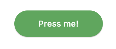
Custom Colors and Padding
To customize the button’s padding along with its colors and BorderRadius, wrap the Text widget in a Padding widget. We added EdgeInsets.symmetric to the Padding widget which provides consistent horizontal and vertical padding to the button text.
ElevatedButton(
  onPressed: () {},
  style: ElevatedButton.styleFrom(
    foregroundColor: Colors.white,
    backgroundColor: Colors.green,
  ),
  child: const Padding(
    padding:
        EdgeInsets.symmetric(horizontal: 24.0, vertical: 12.0),
    child: Text('Press me!'),
  ),
),
Check out the live sample of all these button customizations here. You can experiment with them to see how changes affect the button’s appearance.
Conclusion
You can easily achieve rounded buttons with Material Design 3 in Flutter. It’s a more streamlined approach with less code. The four examples showcased in this blog post demonstrate various customization options while maintaining the rounded appearance of the buttons.